


Popular Apps With Bad UX and the Simple Fixes They Keep Ignoring
Explore top responsive web design companies building mobile-friendly, high-performance websites.
Some of the most used apps in the world are also some of the most frustrating to use. Not because of what they do, but because of how they make you do it.
Bad UX does not always mean a broken product. It means a product that makes you work harder than you should. Confusing navigation, notifications you never asked for, features buried three menus deep, or a form that asks the same question twice. These are the small frictions that quietly drive users away.
88 per cent of users are less likely to return to an app after a bad experience. For platforms with millions of users, that kind of friction translates directly into lost engagement, damaged trust, and real revenue walking out the door.
What makes this frustrating is that most of these problems, even in some of the most poorly designed apps on the market, have clear, simple fixes. Here are some of the most widely criticised apps with bad UX and exactly what they could do about it.

1. Workday: Applying for a Job Should Not Feel Like a Punishment
Workday remains one of the most cited apps with bad UI in hiring,users must retype education and work history for every application, even with a CV already uploaded, and its autofill rarely works as intended.
The fix: Remove any field that duplicates what is already in the CV. Keep only what the employer actually needs. Glassdoor does this well contact details, a CV upload, and employer-specific questions. Faster, cleaner, and far less likely to make candidates drop off halfway through.

2. WhatsApp: Delete for Everyone Does Not Actually Delete
WhatsApp’s “delete for everyone” promises a message disappears, but it just gets replaced with “this message was deleted,” still tipping off the recipient ,the kind of copy mismatch that quietly earns even well-loved products a spot among poorly designed apps.
The fix: Rename the feature to accurately reflect what it actually does. Something like mark message as deleted sets the right expectation upfront. The stronger long term fix is to make the feature work the way Telegram does, where messages genuinely disappear for both parties without leaving any trace behind.

3. LinkedIn: A Notification System Nobody Asked For
LinkedIn pulls notifications from over a dozen streams into one inbox, burying a hiring manager’s message next to an old acquaintance’s post a familiar failure among bad UX apps handling professional communication.
The fix: cut notification volume by default and add a single one-click quiet mode.
The fix: Reduce notification volume by default and surface only what is genuinely useful. A single settings page with a one-click quiet mode would solve most of the frustration without a significant rebuild.

4. Microsoft Teams: Too Much Happening on One Screen
Microsoft Teams is used by organisations across the world for day to day communication. But its interface remains a consistent source of frustration, especially for people using it for the first time.
The main navigation sidebar sits on the left alongside a secondary sidebar, a horizontal menu runs across the top, and a sub-chat panel competes for space on the same screen. For large organisations, this interface shows why custom software product development must simplify workflows instead of overwhelming users with features. New users frequently struggle to find their way around during their first few days, which pushes some towards simpler tools entirely.
The separation between Teams and Chat is a recurring complaint. Users are often unsure which one to use for which purpose, and the layout does little to guide them in the right direction.
The fix: Add a permanent, clearly visible toggle to collapse the secondary navigation panel rather than hiding it behind a cursor hover. Simplify the distinction between Teams and Chat with clearer labels and a stronger visual hierarchy. Giving the interface more breathing room would make onboarding significantly smoother without removing any functionality.

5. Snapchat: Fixing Something That Was Not Broken
Snapchat’s 2018 redesign merged stories and messages into one confusing view without warning, alienating years of habitual users overnight a cautionary tale for apps that need to be redesigned,test with real users first.
The fix: Test significant interface changes with real users before rolling them out to everyone. Gradual releases and opt in previews give users the chance to adjust and provide feedback before a change becomes permanent. Design that evolves gradually tends to hold users. Design that revolutionises overnight tends to lose them.

6. Amazon: When More Becomes Less
Amazon’s product pages pack in sponsored listings, recommendations, reviews, and banners until the buy button competes with everything else on screen a textbook case among bad UX design apps trying to do too much at once.
Product pages are packed with sponsored listings, personalised recommendations, customer questions, review summaries, seller comparisons, video demonstrations, and promotional banners. The crowded layout highlights why conversion-focused website development should guide users toward action instead of distracting them.
The fix: Design the product page around one clear action: buying the product. Recommendations and additional content belong on the page, but they should support the purchase rather than compete with it. A cleaner visual hierarchy with less noise between the product and the buy button would directly improve conversion rates.

7. Instagram: Showing Users Content They Did Not Choose
Instagram’s feed increasingly surfaces content from accounts users never followed, and muting without unfollowing isn’t straightforward a shift that’s pushed it toward the apps with bad UI conversation despite its polish. The push towards Reels moved photo content down the feed and changed the feel of the platform in ways that alienated photographers and creators who had built their presence there. The feed increasingly surfaces content from accounts users have never followed, making it harder to keep up with the people they actually wanted to see.
Muting content without unfollowing accounts is not straightforward, and switching to a chronological feed is not a simple option.
The fix: Give users real control over what they see. A clear toggle between an algorithmic feed and a chronological one would address the most common complaint immediately. Allowing users to filter content types without having to unfollow accounts would restore the sense of control that made the platform worth building an audience on in the first place.

8. Spotify: Features That Exist but Cannot Be Found
Spotify buries song credits and queue management in sub-menus most users never open, and inconsistency between mobile and desktop compounds the problem , a pattern common to poorly designed apps that hide their best features.
Song credits, queue management, and certain playlist tools are buried deep inside sub-menus rather than placed where users would naturally reach for them. Spotify’s hidden features are a reminder that successful MVP development is not about adding features but making them easy to discover and use.
The fix: Place commonly used features at the moments in the experience where users are most likely to need them. Song credits belong on the now playing screen. Queue management should be one tap away. A feature that exists but cannot be found delivers no value to the user and no differentiation for the product.
# | App | Link | Where to find the shot |
9 | Netflix | Hover over any title thumbnail in your browsing feed | |
10 | Airbnb | Search results page, before opening a listing | |
11 | Uber | Mobile app only | Request a ride, screenshot the fare confirmation / active trip screen |
12 | Ryanair | Start a booking → add standard hand luggage only → watch for the upsell pop-up | |
13 | Apple | On-device only | Settings → General → iPhone Storage (or wait for a real low-storage prompt) |
14 | Your News Feed, plus Settings → Settings & Privacy submenu | ||
15 | TikTok | Mobile app only | Profile → Settings and privacy → Privacy |
16 | Google Drive | Any folder with several files, click the search bar’s filter dropdown | |
17 | Discord | Any server → User Settings → Notifications | |
18 | Slack | slack.com or your workspace URL | Workspace → Preferences → Notifications |
19 | Mobile app only | Open a post from your feed, then tap back and note scroll position | |
20 | Amazon Prime Video | Browse feed — look for titles with the small “included with Prime” vs rental tag | |
21 | Zara | Homepage on desktop browser (not mobile) | |
22 | HuffPost | Homepage, plus scroll to any article page for the layout contrast |
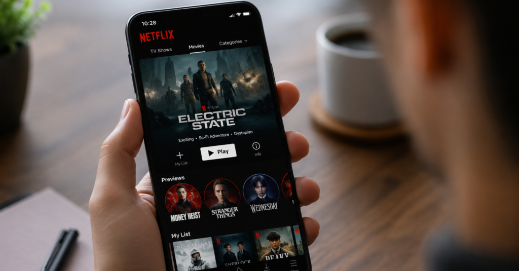
9. Netflix: A Trailer You Never Asked to Watch
Netflix isn’t usually grouped with apps with bad UI, but this one feature undercuts an otherwise clean interface. It automatically plays a trailer, often at full volume, the moment your cursor lingers over a title in your browsing feed.
The fix: Make autoplay opt-in rather than the default, and mute it entirely even when active. Giving users control over whether previews play at all would remove one of the most consistently frustrating parts of browsing the platform.
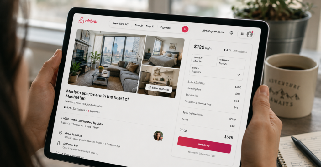
10. Airbnb: The Price You See Is Rarely the Price You Pay
Airbnb shows a nightly rate that hides cleaning fees, service fees, and taxes until a listing is opened, making price comparison difficult, a recurring complaint among bad UX apps in travel booking.
The search filters compound the problem. With dozens of options for amenities, cancellation policies, and property types, narrowing down a location often takes longer than it should, and there is no way to save a common filter combination for future searches.
The fix: Show one consistent total price across search results and listing pages, with fees itemised below rather than hidden until checkout. Let users save a preferred filter set so repeat searches start from where they left off, not from scratch.
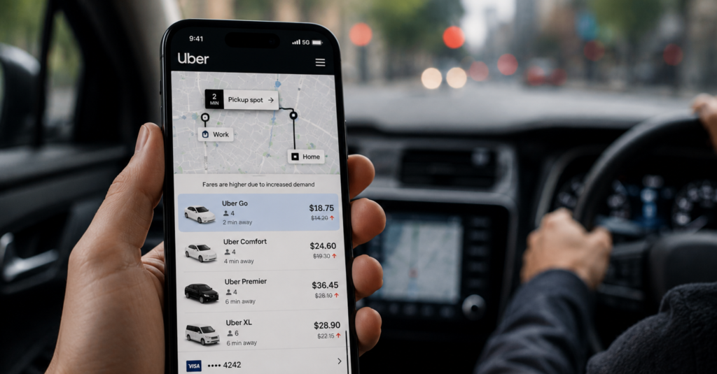
11. Uber: Prices and Options That Shift Mid-Ride
Uber’s surge pricing is shown as a multiplier or a final fare, but it can shift between requesting a ride and confirming it, leaving riders unsure what they actually agreed to pay, one of the clearer bad UX apps examples in everyday use.
The fix: Lock in the quoted fare for a short confirmation window instead of letting it shift silently, and surface ride-editing options clearly on the main trip screen rather than inside a secondary menu.

12. Ryanair: When the Design Is Working Against You
Ryanair’s booking flow is a well-documented example of dark patterns, design choices built to push users toward spending more than intended rather than to help them complete a task smoothly. Attempting to book with only standard hand luggage typically triggers a full-page prompt pushing a paid luggage upgrade priced close to the ticket itself.
The upgrade button is visually designed to draw the eye more than the option to continue without it, and similar tactics appear again at the travel insurance and priority boarding steps later in checkout.
The fix: Remove the forced upsell pop-ups and give every option equal visual weight regardless of which one is more profitable. Being upfront about costs, even inconvenient ones, builds far more trust than pressuring users into add-ons they didn’t ask for.
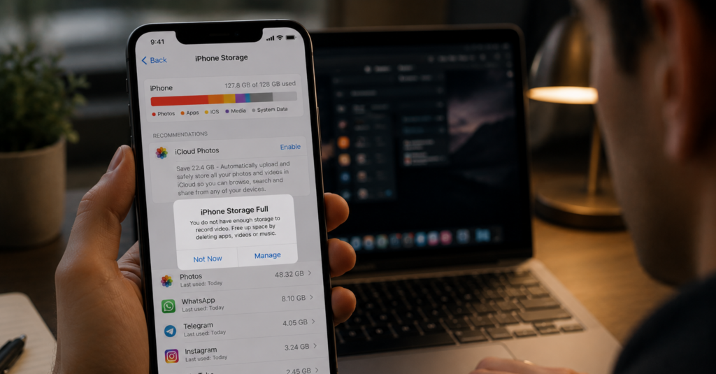
13. Apple: A Storage Warning With No Way Forward
When an iPhone runs low on storage, Apple’s warning tells users to go check settings but stops there. It doesn’t say which file types are taking up the most space or how much needs to be freed to fix the problem, leaving people to figure it out themselves, often at the exact moment they’re trying to capture something in the moment.
The “Not Now” dismissal option doesn’t actually go away either; it keeps reappearing until the underlying issue is resolved, adding a second layer of friction to an already unhelpful message.
The fix: Rewrite the warning to name the largest space-consuming file types and the amount needed to resolve the issue, with a direct link to clear duplicate photos or unused apps from that same screen.
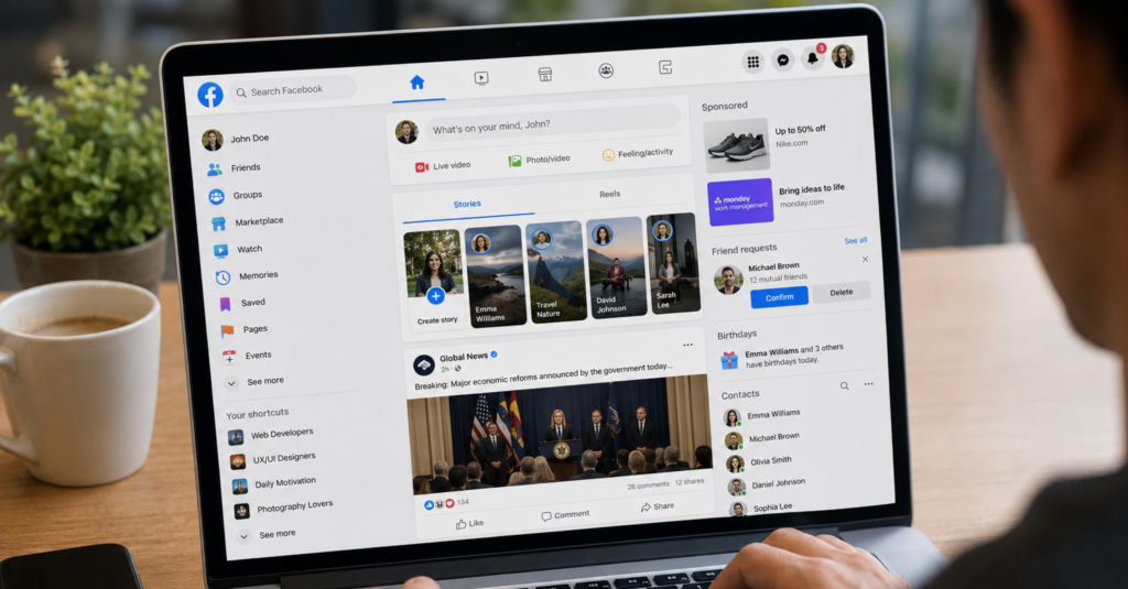
14. Facebook: A Homepage Built for Everything, Useful for Nothing
Facebook is proof that even long-established platforms can end up among poorly designed apps in specific areas. Its News Feed blends friend updates, group activity, sponsored posts, and suggested content into one undifferentiated scroll, so finding a specific update means paging past several unrelated content types first.
The fix: Give core content types their own dedicated tabs instead of interleaving them in one feed, and keep settings organised under fewer, clearly labelled categories rather than nested submenus.
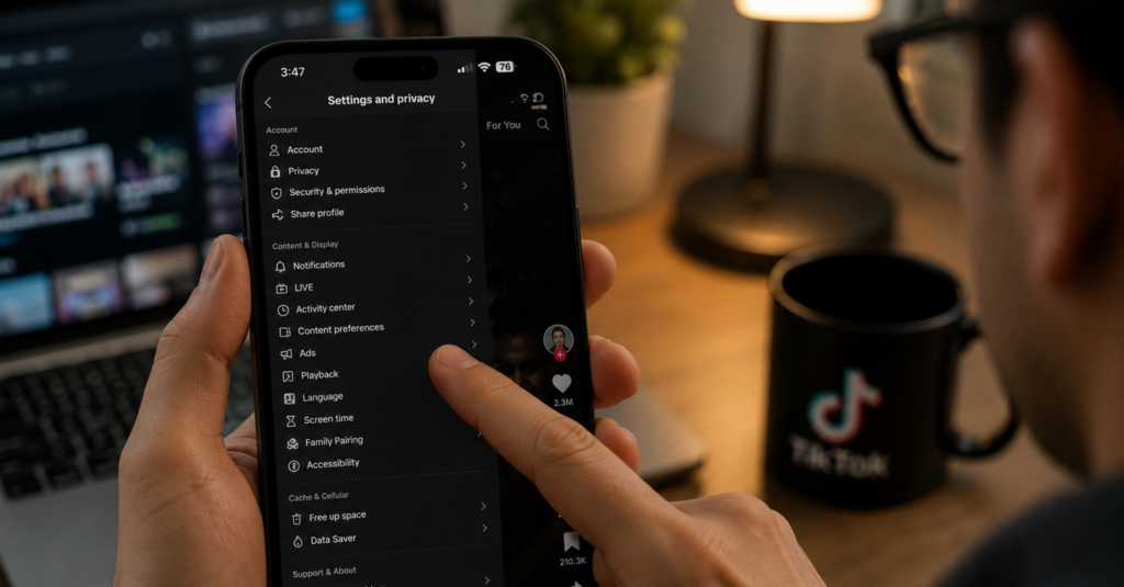
15. TikTok: Privacy Settings Nobody Can Find
TikTok’s privacy controls, covering who can view your videos, message you, or duet your content, are split across several nested menus that most users never think to open. Understanding what each toggle actually controls requires reading fairly technical language that isn’t explained anywhere in the app itself.
For a platform built around short-form video from often younger users, this creates a real gap between what people assume is private and what is actually visible to others.
The fix: Consolidate privacy settings into a single, plainly worded screen, and add a short explanation under each toggle describing exactly what turning it on or off changes.
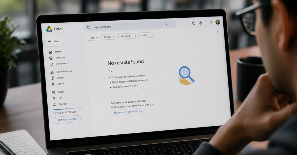
16. Google Drive: Files That Exist but Cannot Be Found
Google Drive’s search improves the more specific a query is, but its filtering options for file type, owner, or last-modified date are tucked behind a small dropdown most users never notice. As a Drive fills with shared folders and duplicated file versions, locating a specific document becomes a scroll-heavy exercise rather than a quick search.
Folder organisation offers little visual differentiation beyond a generic folder icon, so distinguishing a project folder from an archive folder at a glance is difficult once a workspace has more than a handful of them.
The fix: Surface the filter options directly in the main search bar rather than behind a dropdown, and allow folder colour-coding or icons by default so users can visually distinguish folders without opening each one.
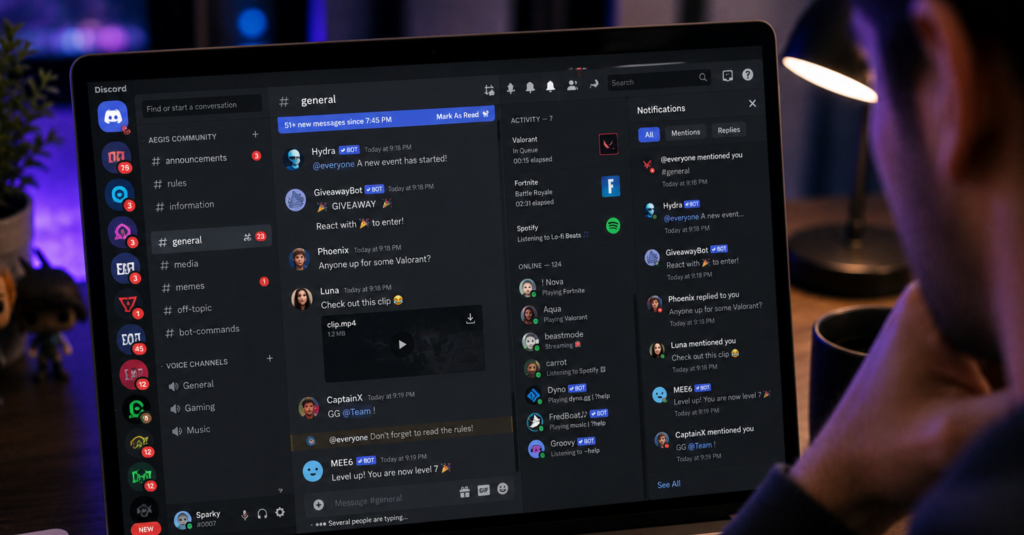
17. Discord: A Notification System That Never Stops
Discord’s notification defaults are a textbook case study for bad UX design apps built around engagement rather than user control. They notify users for nearly every message across every server and channel they’ve joined, which quickly becomes unmanageable for anyone active in more than a few communities.
The fix: Default new server joins to a quieter notification tier rather than “all messages,” and add a single global mute-all-except-mentions toggle so users aren’t stuck configuring each server individually.
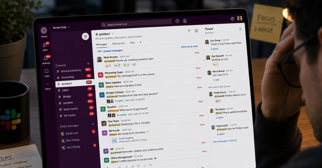
18. Slack: Pings That Drown Out the Important Ones
Slack’s default notification settings alert users for activity across every channel and direct message, regardless of whether the content is time-sensitive or not. In workspaces with dozens of channels, this creates a steady stream of interruptions that makes it hard to tell an urgent mention from routine chatter.
The “Do Not Disturb” feature exists, but it has to be manually scheduled or triggered each time, rather than intelligently adjusting based on a user’s actual working hours.
The fix: Make channel-level notification preferences easier to set in bulk rather than one at a time, and let Do Not Disturb sync automatically with a user’s calendar or working hours by default.
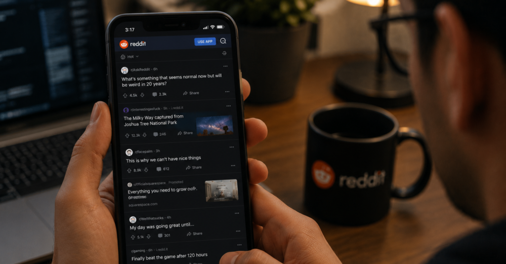
19. Reddit: A Mobile Experience Stuck in the Past
Reddit’s mobile experience is a reminder that bad UX apps aren’t always new or unpolished, sometimes they’re just years behind their own desktop version. Navigation patterns and layout inconsistencies feel noticeably behind the experience the desktop site offers.
The fix: Preserve scroll position when navigating back from a thread, and bring mobile navigation patterns in line with the more refined structure already used on desktop
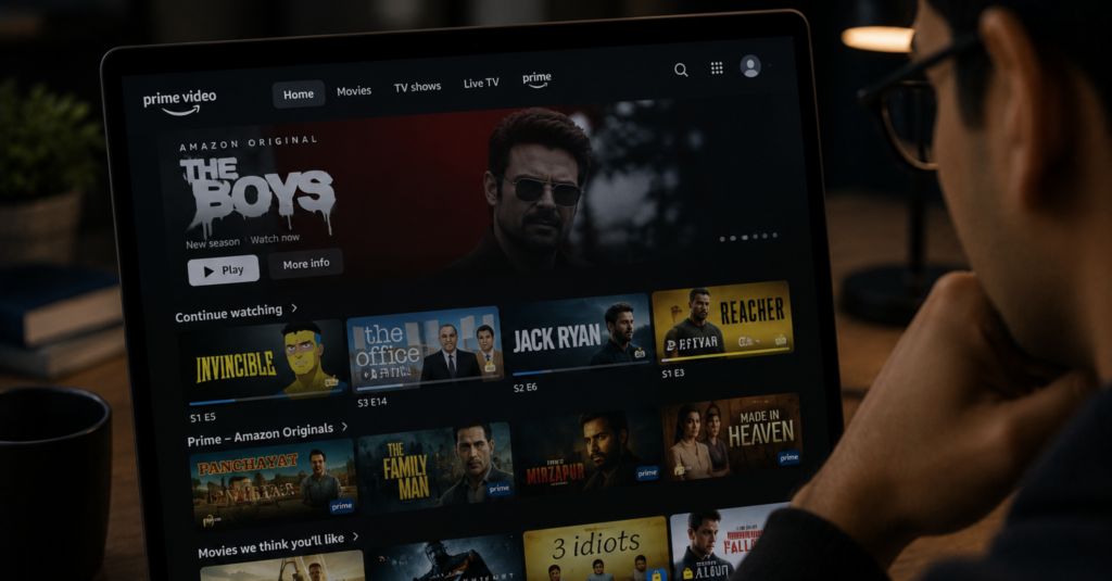
20. Amazon Prime Video: Free or Paid, Rarely Clear Which
Prime Video’s browsing feed mixes titles included with a Prime subscription alongside content that requires an extra rental fee or add-on subscription, with only a small icon distinguishing the two. It’s easy to click into something expecting it to be included, only to land on a payment prompt.
Star ratings compound the confusion, since titles with only a handful of early reviews can display misleadingly high or low scores that don’t reflect broader critical or audience reception.
The fix: Add a clear, prominent label distinguishing free-with-subscription titles from paid content directly on the browsing thumbnail, not just the detail page, and hold back star ratings until a review count crosses a meaningful threshold.

21. Zara: A Website That Forgot to Help You Shop
Zara’s website belongs on any list of poorly designed apps and sites that chase aesthetics over usability. The homepage leans entirely on a rotating image slideshow, with no headline, supporting copy, or clear call to action guiding a first-time visitor toward what to do next.
The fix: Add a visible primary navigation bar on desktop rather than hiding it behind a hamburger icon, and give the homepage at least one clear entry point, like “shop new arrivals,” instead of relying on visuals alone.
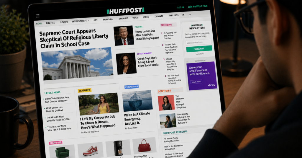
22. HuffPost: A Layout That Breaks Its Own Rules
HuffPost is a strong candidate for any list of apps that need to be redesigned from the homepage down. Its main navigation menu sits in the middle of the page rather than the header, where most visitors expect it, while the header itself is taken up by a rotating content carousel.
The fix: Move primary navigation into the header where design conventions place it, and apply the cleaner grid structure used on other sections of the site to the homepage as well, for a consistent experience across pages.
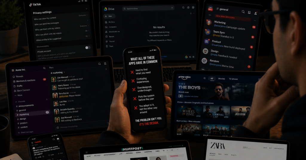
What All of These Apps Have in Common
Looking across every example here, the same patterns keep reappearing. Steps that could be removed. Features that do not behave the way their names suggest. Notifications that overwhelm rather than inform. Screens cluttered with elements competing for attention all at once.
The underlying cause is usually the same. Companies prioritise adding new features and chasing growth metrics over improving the experience people already have. But users feel the difference every time they open the app.
The frustrating part is that most of these fixes are not complicated, even for apps that need to be redesigned from the ground up. They do not require full redesigns or months of engineering time.

AI-IoT Geeks Builds Digital Products Users Actually Enjoy Using
Most UX problems do not happen because companies lack features. They happen because products are built without enough focus on how real users interact with them every day.
At AI-IoT Geeks, we help businesses create digital experiences that are faster, cleaner, and easier to use .From reducing friction in customer journeys to improving navigation, onboarding, and conversions, our approach focuses on building products that users can understand without confusion. Whether it is a business website, SaaS platform, mobile application, or enterprise software solution, we create scalable digital products designed around usability and long-term growth.
If your platform is struggling with engagement, retention, or conversion issues caused by poor UX, investing in user-focused product development can directly improve how customers interact with your business online.
Related Reading
- Best Responsive Web Design Companies
- Introduction To Healthcare UX Design
- Top UI UX Design Agency List 2026
- Enterprise Application UX: From Frustration To Results
- Introduction To UX Audit
- Fintech UX Design: Building Better Digital Financial Experiences
- Adaptive vs Responsive Design: Full Comparison Guide
- UX Project Management: How to Go from Research to Launch
- UX Best Practices: How to Build Experiences That Convert
- UX & SEO: Boost Rankings with Google’s Hidden Signals
Improve UX Before Users Leave Your App
Book a Free Strategy Call at aiiotgeeks.com
Have any questions in mind
Frequently Asked Questions?
What makes an app have bad UX?
Bad UX happens when a product makes users work harder than they should. This includes confusing navigation, too many steps to complete a simple task, unclear labels, notification overload, and features that do not behave the way they appear to.
Can a popular app still have bad UX?
Absolutely. Many of the most widely used apps in the world have well documented UX problems. Popularity means people are using the product despite its friction, not that the friction does not exist.
How does bad UX affect a business?
It increases drop off rates, reduces engagement, damages brand trust, and pushes users towards competitors. Poor UX costs businesses far more than the investment needed to fix it.
What is the most common UX mistake apps make?
Overcomplicating simple tasks is the most consistent pattern. Whether that is a form asking for the same information twice, a feature buried three levels deep, or a notification system with no easy way to turn it off, the root problem is the same: the product is not respecting the user’s time.
How do you fix bad UX without a full redesign?
Start by identifying where users drop off or express frustration. Many improvements come from targeted changes to copy, navigation labels, form length, or notification defaults. A focused UX audit will surface the highest impact fixes without requiring a product rebuild from scratch.