


Fintech UX Design: What It Takes to Build Financial Products People Actually Trust
Building Trust Through Better Fintech UX Design and User-Centered Experiences
Fintech UX design does not fail because developers ship bad code. It fails because the people building the product treat the interface as an afterthought once the architecture is done.
A payment flow that makes a user second-guess whether their transaction went through. An investment dashboard that dumps seventeen data points on one screen with no hierarchy. An onboarding process that asks for the same information three times. These are not edge cases, they are the norm across a sector that still treats design as decoration rather than infrastructure.
This piece covers what fintech UX design actually involves, why it breaks down in practice, and how the companies that get fintech UX design right approach the problem differently.

What Is Fintech UX Design?
Fintech UX design is the practice of creating digital experiences for financial products that feel safe, simple, and trustworthy. It covers everything from banking apps and digital wallets to investment platforms, insurance tech, and crypto products, spanning the full range of financial services UX challenges fintech teams face today.
But the definition barely scratches the surface of what the job actually demands.
Fintech UX design is not art. It is the engineering of human behavior in the context of how people interact with their money through digital channels. Unlike an e-commerce app where bad UX means a user does not buy a shirt, bad UX in fintech can mean a user fears for their retirement savings or their child’s college fund.
That emotional weight changes everything about how you design.

What Fintech UX Design Is Actually Solving
Fintech UX design is not about making financial products look clean. It is about shaping a fintech user experience that works well enough to earn user confidence and keep it.
When someone uses a food delivery app and the experience is clunky, they are mildly annoyed. When someone uses a payment platform and cannot tell if their transfer completed, or a lending app that buries its fees in a wall of legal text, the response is something closer to alarm. Trust, once broken in a financial context, rarely comes back.
Fintech UX design operates across a broad range of product types, neobanks and digital current accounts, mobile payments, cross-border transfers, investment platforms, lending tools, insurance products, crypto exchanges, and the compliance infrastructure that sits behind all of them. Each category carries its own anxiety triggers for users and its own regulatory constraints for designers.
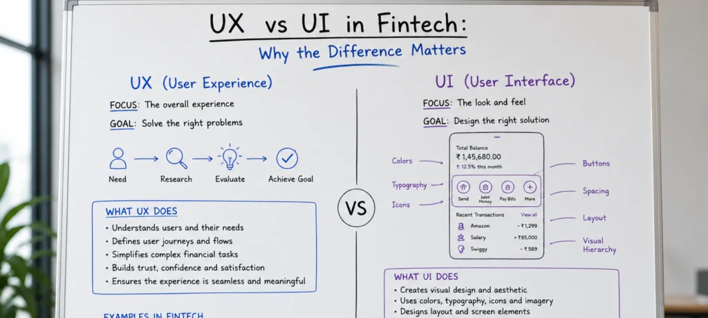
UX vs UI in Fintech: Why the Difference Matters
Most teams treat UX and UI as the same thing. That is one of the most expensive mistakes in fintech product development.
Think of it this way. UI is the tablecloth, the candlelight, the font on the menu. It is your color palette, typography, and button styles. UX is whether the food arrives on time, whether the waiter understands what you ordered, and whether you leave wanting to come back.
You can have a beautiful UI, a stunning restaurant, with terrible UX where the food takes two hours and comes out cold. In fintech, this is the equivalent of a beautiful app that crashes during a transfer or hides fees until the last step.
Both have to work together, and in fintech, neither can carry the other.
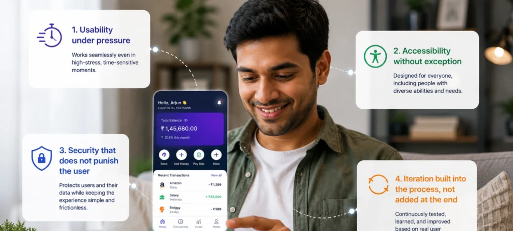
The Four Things That Determine Whether Fintech UX Design Works
Usability under pressure
Financial decisions are rarely made in calm, distraction-free conditions. A user checking their balance on a commute, approving a payment under a deadline, or reviewing a loan offer at 11pm needs the interface to work without demanding their full attention. Fintech UX design that requires effort signals, however subtly, that the product is not trustworthy. Personalisation tailoring dashboards, alerts, and recommendations to the individual user’s actual behaviour and goals, shifts the experience from generic to genuinely useful.
Accessibility without exception
Financial services touch people of every age, ability, income level, and digital literacy. Fintech UX design that does not accommodate screen readers, motor impairments, varying language preferences, and low-bandwidth conditions is not accessible and that is both a business and an ethical failure. The users most likely to be excluded are often the ones most in need of good financial tools.
Security that does not punish the user
Fintech companies are among the most targeted for cyber attacks, and the cost of a breach goes well beyond the technical remediation. IBM’s research has consistently placed the average cost of a data breach in financial services among the highest of any sector. The design challenge is embedding robust security two-factor authentication, session management, data transparency controls, without creating so much friction that users start looking for ways around it or abandon the product. That balance is not an accident. It is the result of deliberate fintech UX design decisions made at every stage.
Iteration built into the process, not added at the end
Regulations change. Threat vectors evolve. User expectations shift faster in fintech than almost anywhere else. A product that was well-designed eighteen months ago may now have onboarding flows that conflict with updated KYC requirements, or a data display that feels dated compared to what competitors have shipped. Fintech UX design treated as a living system rather than a completed deliverable is what separates products that age well from those that accumulate technical and experiential debt simultaneously.
Where Fintech UX Design Actually Breaks Down
The challenges in fintech UX design are specific enough that generalist design teams consistently underestimate them. Here is where products typically fall apart and what actually fixes each problem.
Regulatory Compliance Is a Design Problem, Not Just a Legal One
AML and KYC requirements, data protection obligations, consent frameworks, fee disclosure standards, these have to be surfaced in the interface in ways users can actually understand and act on. A compliance failure often looks, from the user’s perspective, like a UX failure first.
KYC flows in particular push users to their limits. Most financial platforms require identity verification through multi-step forms, ID document scans, and video selfies — not because the product team enjoys friction, but because the law requires it and deepfake technology has made passive verification unreliable.
What actually solves it:
- One question per screen, never a wall of fields
- Auto-fill triggered through permitted APIs wherever possible
- A visible progress bar so users know the end is coming
- A plain-language explanation for why each piece of information is being collected
- Clear error states that tell users exactly what went wrong and how to fix it
Cognitive Load Is Structural in Fintech
The information density of a financial product is genuinely high — transaction histories, rate tables, risk disclosures, account hierarchies, balance breakdowns. Fintech UX design has to make architectural decisions about what gets shown when, what lives behind progressive disclosure, and how data is visualised so it informs rather than overwhelms. Getting this wrong is not a minor inconvenience. In the context of financial decisions, it is a real source of harm.
What actually solves it:
- Show the balance first, context second, full breakdown only on demand
- Every screen has one primary action — nothing competing with it
- Secondary data lives behind carousels or accordions, not on the main view
- Long forms are broken into steps with saved progress and a time estimate upfront
- Labels, colour, and typography do the hierarchy work so users do not have to
The Automation Boundary Requires Judgment
AI-driven automation handles routine fintech processes efficiently transaction categorisation, fraud flagging, credit scoring inputs. But it cannot handle context, nuance, or the moments where a user’s situation does not fit the model. Fintech UX design has to define where automation serves users and where it needs to hand off to a human interaction without making that transition feel jarring or untrustworthy.
What actually solves it:
- Define clear handoff triggers before building the automated flow, not after
- Make it obvious to users when they are talking to a system versus a person
- Give users a visible and easy route to human support at every automated step
- Never let an automated decision that affects money go unexplained — show the reasoning in plain language
Security vs Usability Is a Permanent Tension
Every security layer adds friction. Every removed friction point opens a vulnerability. Two-factor authentication, session timeouts, re-authentication before high-value actions users understand these exist for a reason, but they will abandon a product that makes them jump through hoops every single time.
What actually solves it:
- Risk-based authentication step up security only when the action warrants it
- Passive signals like device recognition to reduce unnecessary re-verification
- Positive friction used deliberately: a confirmation screen before a large transfer, a brief summary before a loan submits
- Clear, non-alarming language around security prompts so users feel protected, not suspected
Making Finance Emotionally Engaging
Finance is inherently stressful. Anxiety around money does not disappear because an app has a clean interface, it has to be actively designed against. Fintech gamification, when done with restraint, reframes money management as a series of small wins rather than a source of dread.
Revolut does this through savings vault progress tracking. Early Robinhood did it through the simplicity of watching a first trade execute. The goal is not to trivialise money. It is to make the act of managing it feel like forward momentum.
What actually solves it:
- Savings goals with visible progress rather than raw numbers sitting in an account
- Milestone acknowledgements for meaningful financial behaviours first investment, debt cleared, budget kept
- Contextual nudges tied to the user’s actual goals, not generic financial advice
- Celebratory micro-interactions that reward completion without trivialising the decision

What Good Fintech UX Design Looks Like in Practice
The practical signals of strong fintech UX design are visible if you know what to look for.
Long onboarding forms are broken into steps with clear progress indicators and, where possible, prefilled with information the platform already has. Users can save progress and return without losing context. The value proposition is visible at the top of the flow, not buried after the friction.
Data-heavy screens use visual hierarchy, colour, and labelling to guide the eye. Secondary information lives behind accordions or carousels. Nothing is presented in bulk that could be presented progressively.
Positive friction is used deliberately. A confirmation step before a large transfer, a brief summary screen before a loan application submits these are not obstacles. They are design interventions that prevent costly mistakes and signal to users that the product is thinking about their interests, not just processing their inputs.
Personalisation is functional, not cosmetic. Recommendations, thresholds, and alerts are based on the individual user’s actual financial history and stated goals, not demographic assumptions.

The Core Principles Every Fintech UX Designer Must Know
Trust and Transparency
In fintech, trust equals retention. One vague message or unexplained number can instantly trigger doubt, leading users to abandon a task or stop using the product altogether. Information should be revealed early and clearly, with plain language for fees, risks, wait times, and next steps.
Trust is also visual before it is verbal. Every pixel on a screen communicates stability or doubt. A microcopy that explains a verification step, an onboarding animation that visualizes encryption, or a calm confirmation message can make even complex transactions feel accessible.
Simplicity Without Hiding What Matters
What makes fintech tools complicated most of the time is their impenetrable language. Cash flow, financial statements, gross profit these are terms most people do not use daily. Financial literacy is not your users’ concern. It is yours. To ensure a seamless experience, a financial app needs to be understandable to everyone, novice or expert alike.
Progressive disclosure is the tool that makes this possible. Instead of dumping every form field upfront, you reveal information as it becomes relevant. Users see only what they need at each step, with deeper detail available on demand.
Security That Feels Like a Feature
There is a paradox in fintech that design teams must solve: users want their money as secure as Fort Knox but want to access it as easily as opening a text message. UX must thoughtfully find answers to where to add friction intentionally and where to remove it completely.
The answer is passive security. Biometric authentication, trusted device recognition, and behavioral analysis running silently in the background keep protection strong without making users feel interrogated every time they check their balance.
Personalization That Respects Boundaries
Delivering micro-personalized financial experiences is no longer a nice-to-have. It is the bare minimum users expect. A 40-year-old opening an investment app does not want to see offers for student loans. A 20-year-old might not be interested in home loans. However, personalization should make users feel understood rather than managed.
The key is restraint and transparency. Always explain why a recommendation is being made and give users control over how they receive it.
Accessibility as a Market Opportunity
About 15% of the world’s population experiences some form of disability. If your app does not support screen readers or has poor color contrast, you are actively blocking 15% of your potential customers. Designing with WCAG compliance, large touch targets, diverse imagery, and multilingual options is not just about ticking a compliance box. It is about who gets to participate in financial services.

Where AI-IoT Geeks Brings Something Different to Fintech UX Design
Most fintech UX design agencies work from the interface outward. AI-IoT Geeks works from the data and system layer inward, which changes what is possible.
Because the team works at the intersection of AI-driven systems and connected device infrastructure, fintech UX design delivered by AI-IoT Geeks is built with an understanding of how the underlying data actually behaves — in real time, across platforms, and under the load conditions that real users create. That means personalisation that is genuinely dynamic, not just rule-based. Security UX that reflects how threats actually emerge rather than how they looked when the product launched. Dashboards designed around data streams, not static snapshots.
For fintech companies building products where the experience has to adapt — to regulatory changes, to user behaviour, to the output of AI models running in the background — this matters more than visual polish.
Services include fintech UX strategy, financial UX audit work, user research and journey mapping, interface design and prototyping, AI-powered personalisation design, IoT-connected financial product interfaces, compliance-aware design systems, and ongoing iteration support.
Services include fintech UX strategy, financial UX audit work, user research and journey mapping, interface design and prototyping, AI-powered personalisation design, IoT-connected financial product interfaces, compliance-aware design systems, and ongoing iteration support.
Visit AI-IoT Geeks to talk about what your fintech product needs and where the current experience is leaving users behind.
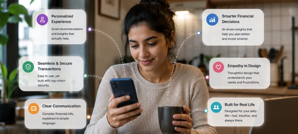
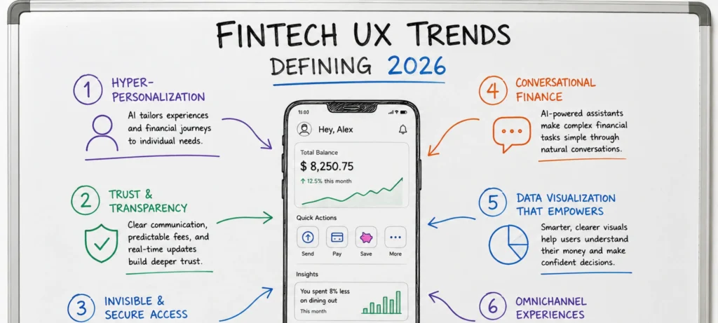
Fintech UX Trends Defining 2026
AI is moving from a backend tool to a front-facing design layer. AI can help fintech platforms move from static interfaces to dynamic, predictive ones, through predictive budgeting and contextual nudges that make the platform feel proactive rather than reactive.
Voice UI is gaining ground as both a convenience and a critical accessibility feature for older users and those with visual impairments. Embedded finance is pushing design teams to maintain consistent trust signals across payments happening inside messaging apps, retail platforms, and investment dashboards simultaneously.
A clunky AI feature can erode trust faster than a market crash. Integrating AI effectively without unsettling users requires a new level of design and development discipline. Personalization must always feel like the app is on the user’s side. Never like it is watching them.
Your Fintech Product Is Only as Strong as the Experience Behind It
Most fintech companies do not lose users to competitors with better technology. They lose them to competitors with better experiences. If your platform has onboarding drop-off you cannot explain, support tickets that keep repeating the same complaints, or conversion rates that do not reflect the quality of your product, the problem is almost always in the design layer.
AI-IoT Geeks designs fintech UX from the system up. Not just how it looks, but how it behaves under real conditions, with real users, against real regulatory requirements. If your product needs a UX audit, a ground-up redesign, or a design partner who understands what sits beneath the interface, that is the work we do.

Talk to the AI-IoT Geeks team about your fintech product
Book a Free Strategy Call at aiiotgeeks.com
Have any questions in mind
Frequently Asked Questions?
1.How do I know if my fintech product has a UX problem?
If users understand your product but still drop off during onboarding or abandon transactions that is a UX problem. A quick audit will confirm it before you spend money fixing the wrong thing.
2.How long does a fintech UX audit take?
Typically one to three weeks. You get a prioritized fix list ranked by conversion impact, drop-off analysis, heatmap findings, and recommendations your dev team can act on immediately.
3.Can good UX improve KYC completion rates?
Yes significantly. KYC abandonment is almost entirely a UX failure. Single-step verification, progress indicators, and clear error states consistently lift completion rates without changing any regulatory requirement.
4.We have a design team. Why bring in an external UX partner?
Internal teams are too close to the product to see what new users see. An external partner brings fresh eyes, honest findings, and no assumptions exactly what a useful audit requires.
5.How is AI-IoT Geeks different from a standard UX agency?
Most agencies design from the interface outward. We work from the data and system layer inward accounting for real-time data behavior, AI outputs, and security requirements at every design step.
6.When is the right time to invest in fintech UX?
Before launch, after launch, and before any redesign each for different reasons. The worst time is never. The second worst is after the redesign budget is already spent.