


UX Best Practices to Build High-Converting User Experiences
Creating seamless and user-friendly experiences that boost engagement and drive higher conversions.
User experience is no longer a secondary consideration in digital design. It is the single most decisive factor separating websites that grow from those that quietly bleed revenue. Companies implementing UX best practices focused on conversion see average improvements of 35 to 42 per cent in conversion rates. That is not the result of branding or ad spend. That is the direct output of building better experiences.

What UX Has to Do With Conversion
There is an important distinction worth making upfront. You can have a good user experience without high conversion and vice versa, but the two are intertwined.A better experience built on strong UX best practices reduces friction, builds trust, and often leads to a higher percentage of goal completions.
The goal is not to manipulate users into clicking things. It is to remove every obstacle standing between a motivated user and the action they already want to take.
Real-World Example: How AI-IoT Geeks Built the ASL Platform
Reading about UX project management principles is one thing. Seeing them applied to a real product is another.
The Problem
ASL, a growing real estate company, was expanding fast but their internal tools hadn’t kept pace. Data lived across scattered spreadsheets, teams worked in silos, and leadership had no real-time view of the business.
What AI-IoT Geeks Did
Before writing a single line of code, the team used a strategic Custom Product Development approach to map how ASL’s departments actually worked, identifying friction points first and then building around them.
Built one centralized platform for all property, land, leasing, and sales data
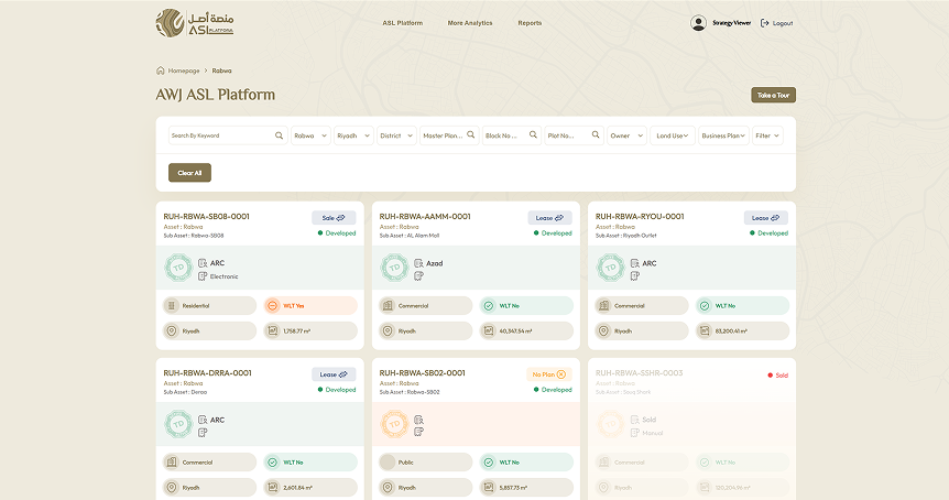
ASL Platform
ASL Platform - Centralized Operations Management
Organizations require efficient systems to manage operations and maintain full visibility across processes. The ASL Platform was developed to provide a centralized solution that integrates data, automation, and control into one interface. By streamlining workflows and improving data flow, the platform enhances operational efficiency, enables better decision-making, and ensures smoother management of day-to-day activities.
✓
Added role-based access so every user sees only what’s relevant to them
✓
Created flexible workflows tailored to each department’s actual process
✓
Delivered live dashboards giving leadership a real-time portfolio view
Why it worked: User needs were identified before solutions were designed. That is UX project management in action.
Cut the Friction From Your Forms
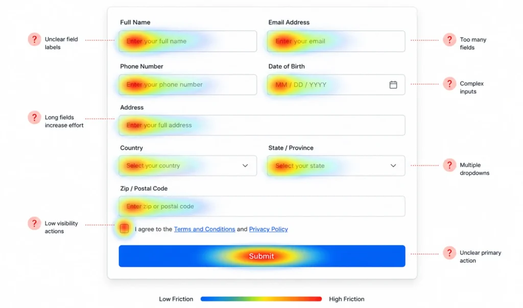
Friction is the silent killer of conversion. It lives in unexpected places: an unclear label, a required field that serves no one, a checkout process that asks for information at the wrong moment.
Cutting a sign up process from ten fields to three by deferring less critical questions until after registration caused completion rates to jump by 20 per cent and reduced time to value by about a third.
Go through every form on your site and ask one question: is this field essential right now? If it can wait, move it or remove it entirely.
Guide the Eye With Visual Hierarchy
Users scan, they do not read. Your layout must direct attention in a deliberate sequence: problem, solution, proof, action.
Clear navigation, visible calls to action, and understandable copy are core website UX best practices that work together to lower bounce rates.
When a user has to think about where to look, you have already introduced friction. Your most important element must be visually dominant. Everything else follows.

Design Mobile First, Not Mobile Compatible
In Q2 2025, mobile devices generated 62.54 per cent of global website traffic. However, many mobile experiences still feel like tiny desktop sites.
Mobile first experiences built through expert Mobile App Development and responsive design strategies keep tap targets accessible and calls to action visible without scrolling.
Mobile UX is not a subset of desktop UX. It is a different experience entirely.

Treat Page Speed as a UX Decision
Speed is not a technical metric. It is a user experience decision and one of the most important UX SEO best practices for reducing bounce rates and improving engagement.
Around 88 per cent of online consumers are less likely to return to a site after a poor experience on a landing page. A slow page is a poor experience, full stop.
Compress images, use caching, and test your load time on a mobile connection. Users do not wait. They leave and rarely come back.

Write Calls to Action That Say Something
A button labelled Submit tells the user nothing. A button labelled Get My Free Report tells the user exactly what they are about to receive.
Your above the fold section should communicate what you offer, why it matters, and what users should do next.
Keep one primary call to action per screen. When users face too many options, they frequently choose none.

Build Trust Before You Ask for Anything
Conversion is the result of thoughtful design, careful testing, and applying UX design best practices that respect the people who use your product.
Display pricing upfront, clarify shipping costs, and provide clear return policies. Transparency eliminates hesitation.
Testimonials, star ratings, case studies, and security badges all contribute. The key is specificity. Vague social proof does little. Concrete, verifiable proof builds genuine confidence.

Show Users Only What They Need, When They Need It
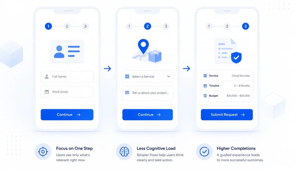
Cognitive overload kills conversion. Too much information at once causes users to freeze or leave.
Reducing cognitive load through clear information hierarchy, progressive disclosure, and simplified decision making significantly improves conversion rates.
Break complexity into steps. Guide users through information in a sequence that matches where they are in their decision. This applies to onboarding flows, checkout, and long form content alike.
Remove Navigation During Critical Moments
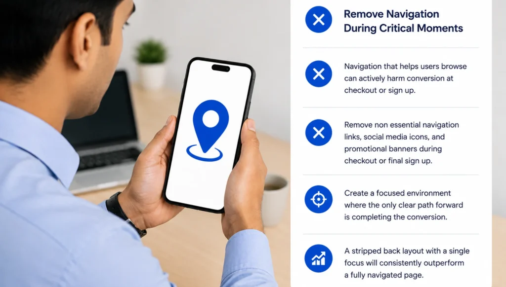
Navigation that helps users browse can actively harm conversion at checkout or sign up.
During checkout or final sign up, remove non essential navigation links, social media icons, and promotional banners. Create a focused environment where the only clear path forward is completing the conversion.
For landing pages and checkout flows, a stripped back layout with a single focus will consistently outperform a fully navigated page.
Test, Measure, and Keep Improving
UX is not a checklist you complete once. It is a discipline of ongoing observation.
Brands that regularly review and improve UX consistently outperform those that rely on assumptions or outdated designs. Good UX decisions are driven by evidence, not opinions.
Use heatmaps and session recordings to understand where users drop off. Run A/B tests to compare design variations. Conduct user testing to surface friction that data alone cannot explain.
For structured UX research and checkout benchmarking, the Baymard Institute is one of the most reliable resources available.

How AI IoT Geeks Can Help
Implementing UX best practices is not just about design changes. It requires a structured approach that combines user behavior insights, performance optimization, and continuous testing. That is where AI IoT Geeks comes in.
We help businesses turn user experience into measurable growth by focusing on what actually impacts conversions.
Our UX & Digital Experience Services Include:
- UX Audit & Strategy
Identify friction points, usability gaps, and opportunities to improve user flow and engagement. - Conversion-Focused Design
Create intuitive, high-performing interfaces that guide users toward action. - User Behavior Analysis
Use heatmaps, session recordings, and data insights to understand how users interact with your site. - Mobile & Responsive UX
Ensure seamless performance across all devices with mobile-first design principles. - Performance & Speed Optimization
Improve load times and overall site performance to reduce drop-offs. - Continuous Testing & Optimization
Run A/B tests and iterate based on real user data to consistently improve results.
Conclusion
These practices work as a system, not in isolation. Reducing friction makes calls to action more effective. Clear hierarchy supports faster decisions. Trust signals create the confidence that turns intent into action. Conversion is the result of thoughtful design, careful testing, and a deep respect for the people who use your product.
AI-IoT Geeks helps businesses apply UX best practices that improve user experience, reduce friction, and drive measurable growth. Start by identifying where motivated users are dropping off. Fix the highest friction points first. Measure, iterate, and build from there. The businesses that convert consistently are the ones that treat UX as an ongoing discipline, not a one time project.
Fix your UX. Grow faster with AIIoT Geeks.
Book a Free Strategy Call at aiiotgeeks.com
Have any questions in mind
Frequently Asked Questions?
How do UX best practices improve conversion rates?
They remove friction, simplify user journeys, and make it easier for users to take action, leading to higher conversions.
How long does it take to see results from UX improvements?
Some improvements can show immediate impact, but consistent results come from ongoing testing and optimization.
What tools are used to analyze user experience?
Tools like heatmaps, session recordings, analytics platforms, and A/B testing help understand and improve user behavior.
Why should I hire a UX design service provider?
Experts bring data-driven insights, proven strategies, and testing frameworks to improve user experience and maximize conversions.
How can AIIoT Geeks help improve my website’s UX?
AIIoT Geeks provides UX audits, conversion-focused design, user behavior analysis, and continuous optimization to improve performance and drive results.