


Adaptive vs Responsive Design: A Clear Overview
Performance, User Experience, and Scalability in Responsive v/s Adaptive Design.
Choosing between adaptive vs responsive design is a key decision that impacts your website’s performance, user experience, and scalability. At AI-IoT Geeks, our team has worked across multiple industries, helping businesses select the right approach based on user behavior, performance needs, and growth goals.
Both approaches aim to create consistent experiences across devices but use different methods. Responsive design relies on fluid layouts and flexible grids that automatically adjust to any screen size, while adaptive design uses predefined layouts optimized for specific devices.
Understanding these approaches and the adaptive vs responsive design differences helps you align your design strategy with your business goals, budget, and user expectations. Whether you prioritize flexibility or precision, the right choice depends on how your audience interacts with your product.
At AI-IoT Geeks, our team combines hands-on development experience and AI-driven insights to implement the most effective design approach for scalable and high-performing digital solutions.
Adaptive vs Responsive Design
Detailed Comparison of Adaptive vs Responsive Design Across Key Factors.
Section
Responsive Design
Adaptive Design
Definition & Core Concept
Fluid layouts that adjust continuously to any screen size
Fixed layouts built for specific screen sizes and breakpoints
How It Works
Fluid grids, flexible images, CSS media queries, viewport meta tag
Fixed breakpoints (320, 480, 760, 960px), server-side device detection
Origin & History
Introduced by Ethan Marcotte in 2010
Rooted in Aaron Gustafson’s progressive enhancement principles
Pros
Single codebase, SEO-friendly, easier maintenance, future-flexible
Faster load on mobile, precise UX control, optimized per device
Cons
Less design control, slower load on heavy sites, complex layouts can break
Higher cost, multiple codebases, harder to maintain and update
SEO Impact
Google’s preferred approach, supports mobile-first indexing
Duplicate content risks, needs canonical tags, extra SEO effort
Performance
Can be slower due to loading all assets regardless of device
Faster on mobile , only loads assets needed for that devic
Cost & Development Time
Lower upfront cost, single codebase saves time
Higher upfront cost, multiple layouts require more development time
Maintenance
Easier, one codebase to update and manage
Complex ,changes must be replicated across multiple layouts
UX Experience
Consistent experience across all devices
Tailored experience per device, higher UX precision
Best For
Blogs, portfolios, startups, content sites, small businesses
E-commerce, enterprise platforms, news portals, high-traffic apps
Industries
Education, healthcare, agencies, personal brands
Retail, finance, media, large-scale SaaS platforms
Hybrid Approach
Can be enhanced with adaptive techniques for critical breakpoints
Can adopt responsive fluidity between fixed breakpoints
2026 Verdict
Best default choice for most projects , flexible and cost-effective
Best when UX precision and device-specific performance are top priorities
Real World Examples
Blogs, portfolios, news sites, small business websites
Amazon, Apple, LinkedIn, device-specific optimized layouts
Should You Use Adaptive Or Responsive Design?
Use Cases for Adaptive and Responsive Design.
Choose Responsive Design If:
You want simplicity, speed to market, and broad compatibility. In the adaptive vs responsive design comparison, responsive design is the smarter default for most projects. Since it runs on a single codebase, it is faster to build, easier to maintain, and more cost-effective in the long run. It is also Google’s preferred approach, which means it naturally supports mobile-first indexing and carries fewer SEO risks.
It works best for blogs, portfolios, startups, content-heavy websites, and small to mid-sized businesses. If you are comparing adaptive web design vs responsive web design for budget and scalability, responsive is usually the better long-term option
Choose Adaptive Design If:
You need precise control over how your product looks and performs on specific devices. Adaptive design is the right call when user experience cannot be compromised , think large e-commerce platforms, enterprise applications, or high-traffic news portals where every millisecond of load time and every design detail directly impacts conversions.
Because adaptive design only loads assets relevant to the detected device, it delivers faster performance on mobile without sacrificing the desktop experience. Industries like retail, finance, and media , where different users have very different needs and behaviors benefit the most from this level of customization. The trade-off is higher upfront development cost and more complex ongoing maintenance.
Not Sure? Go Hybrid:
If your project sits somewhere in the middle, a hybrid approach is worth considering. You can combine responsive foundations with adaptive techniques to balance flexibility and performance in your adaptive vs responsive design strategy.

Quick Decision Guide
Your Situation
Limited budget and small team
Need fast time to market
SEO is a top priority
Simple content or blog site
Large e-commerce platform
Enterprise or high-traffic app
Device-specific UX is critical
Need performance on mobile
Want flexibility with some control
Unsure of your full device audience
Go With
Responsive
Responsive
Responsive
Responsive
Adaptive
Adaptive
Adaptive
Adaptive
Hybrid
Responsive
What Are The Factors To Consider When Choosing Between Responsive And Adaptive Design?
Important Considerations for Adaptive vs Responsive Design.
1. Project Budget
In adaptive vs responsive design, responsive costs less because it uses one codebase and less time, whereas adaptive requires multiple layouts and increases cost significantly. If the budget is tight, responsive is the smarter choice.
2. Target Audience And Devices
We analyze user analytics at AI-IoT Geeks to understand device distribution and recommend responsive design for diverse traffic, while adaptive is suggested when most users rely on specific device types.
3. Performance
Adaptive only loads assets for the detected device which makes it faster on mobile, whereas responsive loads everything regardless of screen size. If mobile speed is critical, adaptive or hybrid wins. As Smashing Magazine notes, while resizing an image for mobile devices can be very simple, if the original image size is meant for large devices, it could significantly slow download times and take up space unnecessarily which is exactly why adaptive design’s device-aware asset loading becomes a stronger choice for performance-critical websites.
4. SEO Goals
Google recommends responsive and it supports mobile first indexing, whereas adaptive can create duplicate content issues and requires canonical tags. For organic search, responsive is safer.
5. Maintenance
We prioritize long term maintainability in every project. Responsive design is easier to maintain because updates apply across a single codebase, while adaptive design requires changes across multiple layouts.
6. UX Precision
If you need a consistent experience across all screens, responsive is enough, but if desktop and mobile users have very different needs, adaptive gives you that control.
7. Timeline
Responsive is faster to build and test, whereas adaptive requires designing and QA testing multiple layouts, adding considerable time to your project.

What Are The Best Practices For Implementing Responsive Design vs Adaptive Design?
Effective Practices for Adaptive vs Responsive Design Implementation.
Best Practices For Responsive Design
At AI-IoT Geeks, our team follows these best practices to build scalable and high performing responsive websites:
- Follow a mobile first approach by designing for smaller screens first
- Use flexible grids and relative units like percentages, rem, and viewport units
- Set breakpoints based on where the layout actually breaks, not fixed devices
- Use responsive images with proper sizing to improve loading performance
- Optimize performance with compression, lazy loading, and minified assets
- Reduce unnecessary CSS and JavaScript to keep pages lightweight
- Test across real devices to ensure consistent behavior and usability
- Prioritize readability and usability across all screen sizes
Best Practices For Adaptive Design
At AI-IoT Geeks, our team applies these practices for precise and device optimized adaptive experiences:
- Use real user analytics to define breakpoints and target devices
- Build fixed layouts for common screen sizes like mobile, tablet, and desktop
- Implement server side detection to serve the correct layout instantly
- Maintain consistent content, branding, and messaging across all layouts
- Create a shared design system for typography, spacing, and components
- Test each layout separately on real devices for accuracy and performance
- Optimize each version individually for speed and usability
- Plan maintenance workflows to manage multiple layouts efficiently

Why Choose AI-IoT Geeks For Your Responsive or Adaptive Design Project?
Our Expertise in Responsive and Adaptive Web Design.
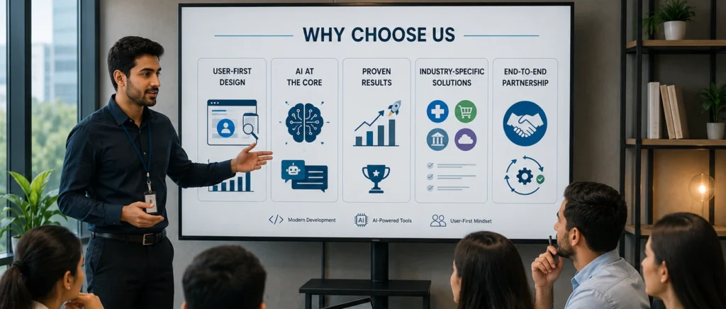
Choosing the right adaptive vs responsive design approach matters , but so does the team building it. At AI-IoT Geeks, we combine modern development, AI-powered tools, and a user-first mindset to deliver websites that don’t just look great on every device , they perform.
User First Design
Our UI UX team uses predictive models, heatmaps, and A B testing to understand user behavior and optimize how users interact with different layouts. Every breakpoint is refined to improve usability and engagement.
AI At The Core
We integrate AI driven personalization and knowledge based chatbots into digital experiences to make them more intelligent. This enables websites to respond to user needs in real time and improve overall interaction quality.
Proven Results
AI-IoT have delivered MVPs within fast timelines across diverse business requirements with a focus on quality and reliability. Our solutions also include scalable systems designed to handle complex data and long term performance needs.
Industry Specific Solutions
We build tailored solutions for industries such as healthcare, retail, finance, and SaaS, ensuring each requirement is addressed effectively. Every project is aligned with workflows, compliance standards, and user expectations for real business impact.
End To End Partnership
We manage the complete process from strategy and design to development, optimization, and ongoing support. Our team acts as a long term technology partner focused on continuous improvement, scalability, and performance.
Conclusion
Both responsive and adaptive design offer strong approaches to building modern websites, but the right choice depends on your priorities such as cost, performance, SEO, and user experience goals. When comparing adaptive design vs responsive design, responsive design is ideal for flexibility, scalability, and long term ease of maintenance, while adaptive design is better suited for highly optimized, device specific experiences where precision matters more than simplicity.
At AI-IoT Geeks, our team evaluates each project carefully to recommend the most effective approach based on real user behavior, industry requirements, and performance expectations. Our focus is always on building solutions that are not only visually consistent across devices but also strategically aligned with business outcomes.
Boost conversions, improve UX, and enhance performance with AI-IoT Geeks’ expert design solutions today.
Book a Free Strategy Call at aiiotgeeks.com
Have any questions in mind
Frequently Asked Questions?
What is the difference between responsive and adaptive design?
When comparing adaptive vs responsive design, responsive design automatically adjusts to any screen size using flexible layouts, while adaptive design uses fixed layouts for specific devices.
Which is better for beginners or small websites?
In adaptive web design vs responsive web design, responsive design is usually better for beginners and small websites because it is easier to build, manage, and scale.
Is adaptive design better for mobile users?
Adaptive design can offer faster mobile performance because it loads only device specific assets, but it requires more development effort and maintenance.
Can I use both responsive and adaptive design together?
Yes, a hybrid approach is possible where a responsive base is enhanced with adaptive techniques for specific breakpoints or devices.
Can AI-IoT Geeks help implement both responsive and adaptive design?
Yes, our team builds both responsive and adaptive solutions based on project requirements, ensuring optimal performance, UX, and scalability.
How does AI-IoT Geeks ensure better results with responsive or adaptive design?
We use user behavior analysis, AI driven insights, and performance optimization techniques to ensure every design decision improves usability, engagement, and long term scalability.